How to Build a Logistics Dashboard
We all know that time is money, but this is especially true in the world of logistics. So, we need easy access to clear insights about what’s going on within our supply chains. Today, we’re exploring how to build custom logistics dashboards in Budibase.
Like with any dashboard tool, the challenge here isn’t so much a lack of data. It’s making sense of the data we do have.
This is critical in situations where we have information about different aspects of our logistics processes coming from different locations - or where the insights we need require more complex querying from our raw data.
As we’ll see today, Budibase makes building professional, custom dashboards for all kinds of existing data sets.
But, before we get to today’s tutorial, let’s check out a bit of background.
What is a logistics dashboard?
A logistics dashboard is a simple interface that displays real-time metrics about key information relating to things like our inventory levels, supply chain, fleets, shipping, fulfillment, vendors, or other logistics management issues.
The key word here is real-time.
So, unlike a typical report, we connect our dashboard UI to some external data source - and then the latest figures for our KPIs and metrics auto-populate in our data visualizations. This means that whoever needs to has a simple, easy way to find the insights they require, without having to go and run the numbers each time.
What should a logistics dashboard include?
This is kind of a tricky question. See, there’s going to be a huge amount of variation in terms of the data that one company needs to present compared to the next. Logistics processes in a local one-truck operation aren’t going to look that much like Amazon’s.
But, we can make some important generalizations.
99.9% of the time, we’re dealing with very high-level insights when we build dashboards.
This means that we’re generally not concerned with individual database entries - but with aggregation functions.
In the case of a logistics and supply chain dashboard, these could be statistics relating to our overall spending, performance, delivery-time targets, breakages, inventory management, stock loss, utilization, or any other relevant KPIs.
With that in mind…
What are we building?
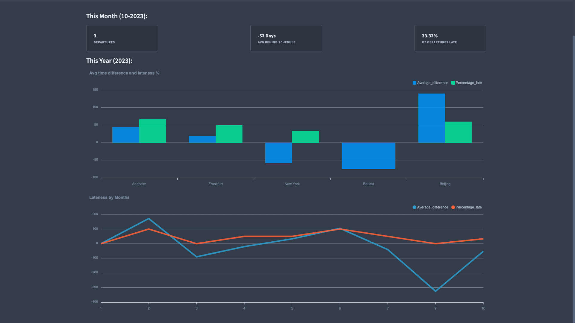
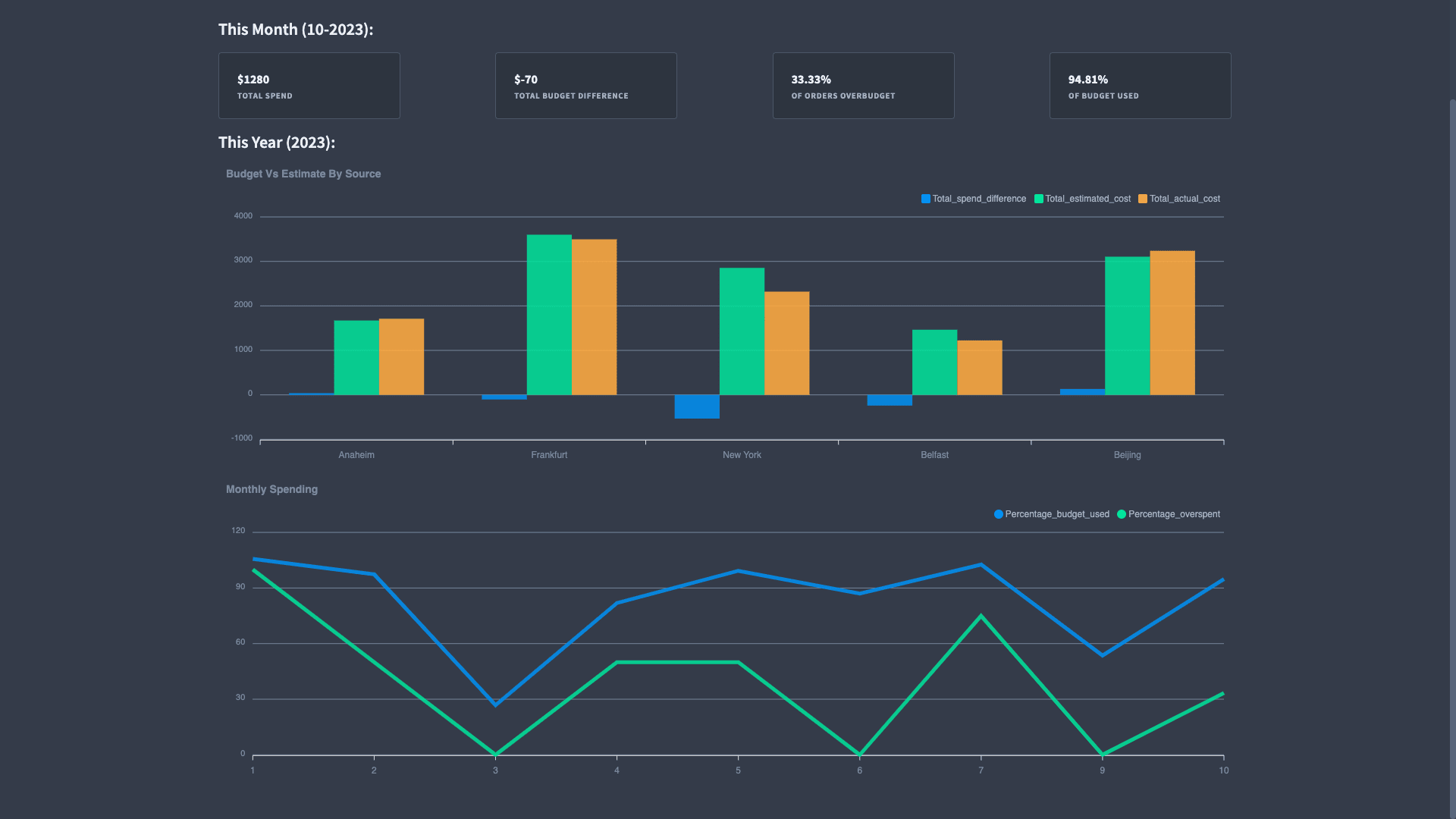
Our dashboard is going to cover statistics on two supply chain management topics - delivery times and costs. Our example will be built around a logistics network with four distribution centers. We’ve built it around two app screens - one for each of our groups of KPIs.
So, for delivery times we have:
And for costs:
How to build a logistics dashboard with Budibase in 5 steps
Let’s get started.
If you haven’t already, go ahead and create a free Budibase app so you can build along with us.
1. Create a new app and connect your data
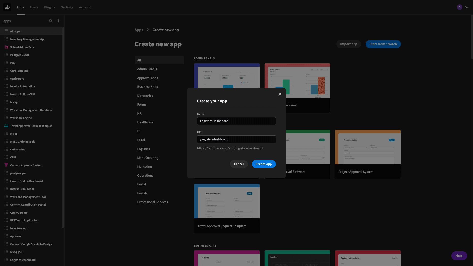
Our first step is to create a new Budibase application. We have the option of using a template or importing an existing app, but we’re going to hit start from scratch. When we do this, we’ll first be prompted to give our app a name:
Then, we’re prompted to pick what data source we want to connect to. Budibase offers an internal database, alongside dedicated connectors for a huge range of SQL and NoSQL databases, as well as Google Sheets and REST API.
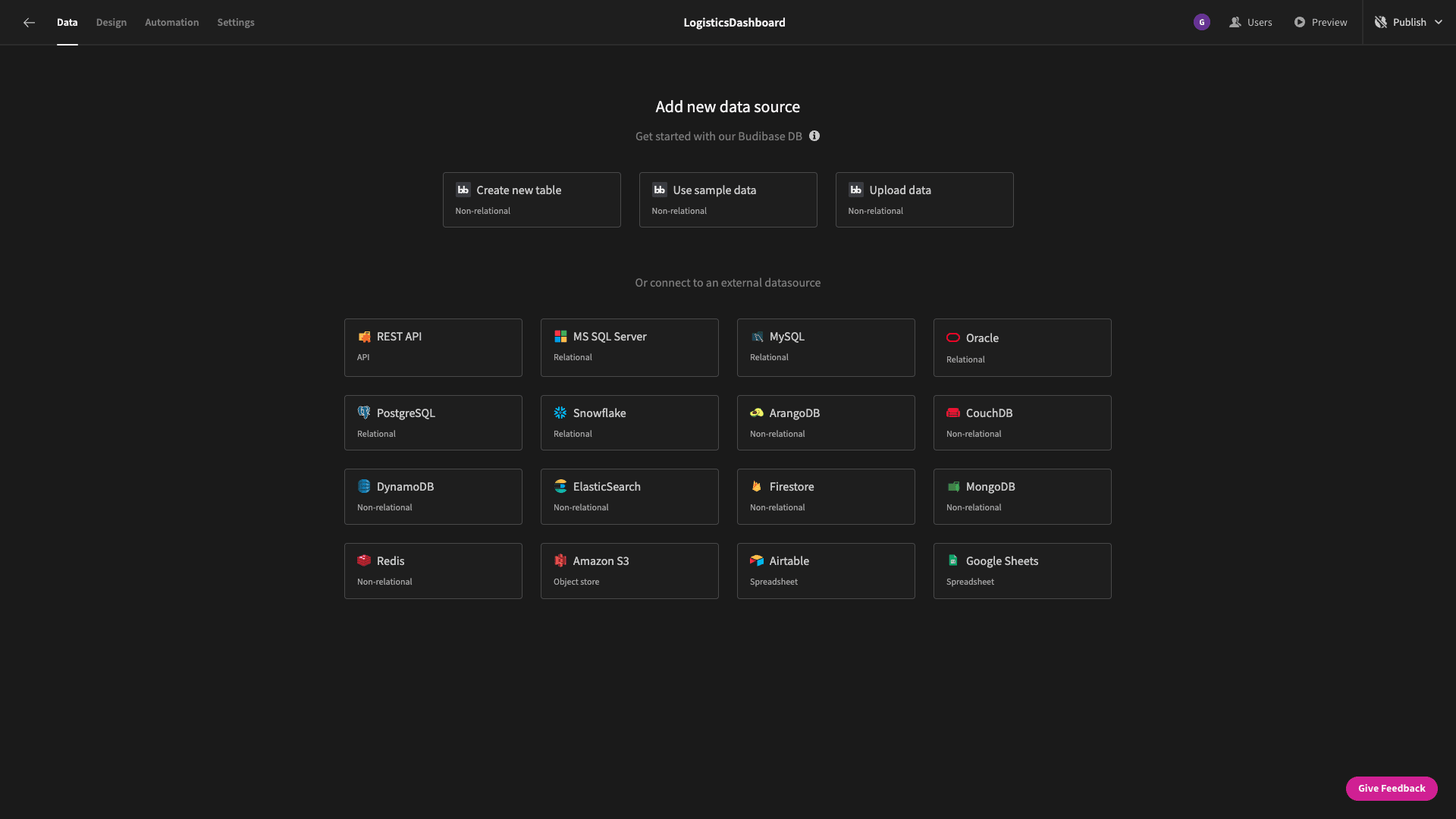
We’re going to go with Postgres since that’s where our demo data lives.
When we click through, we’re asked for our database credentials:

You can fill these in manually - or if you have a business license for Budibase, you can store them as environment variables and access them using the key icon.
Then, we’ll be asked which specific tables from our connected database we want to pull into Budibase.
We can choose to fetch all of them - or only selected ones.
Our database only has one table, called deliveries:

Once we’ve fetched a table, we can begin to edit straight away in Budibase’s data section, with editable rows, columns, and schemas:
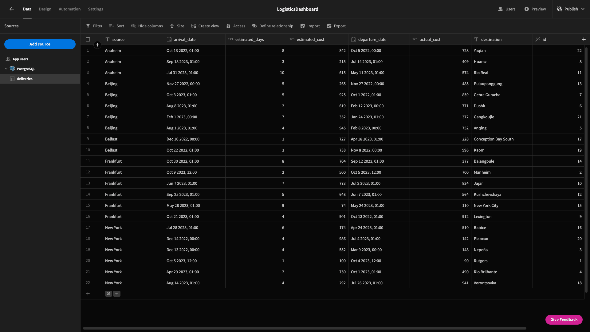
At this point, it’s worth getting familiar with our data model for this demo app. So, we have stored the following attributes about each delivery
- source - the distribution center that the delivery came from.
- destination - where it’s going.
- departure_date - when it left.
- estimated_days - how long we thought it would take.
- arrival_date - when it actually arrived.
- estimated_cost - what we thought it would cost.
- actual_cost - what we really spent.
- id - a unique identifier for each delivery.
But, remember - we’re building a dashboard. So - a lot of what we’re going to display is aggregated data around our table. This means we’re going to use a few custom SQL queries to extract the insights we need.
Let’s start building our dashboard.
2. Building our delivery time stat cards
The first thing we will build is the row of summary cards at the top of our delivery times report.
Head to the design tab and click to create a new blank screen.
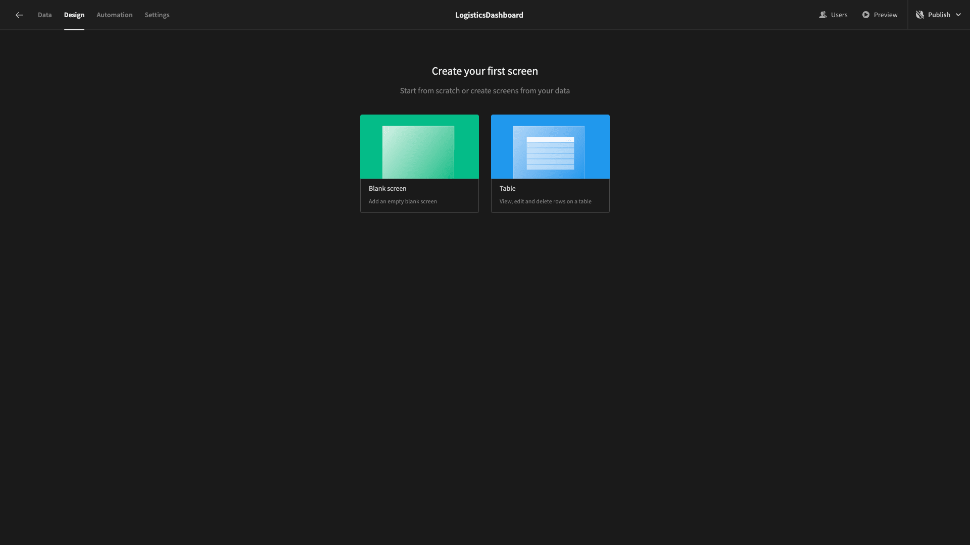
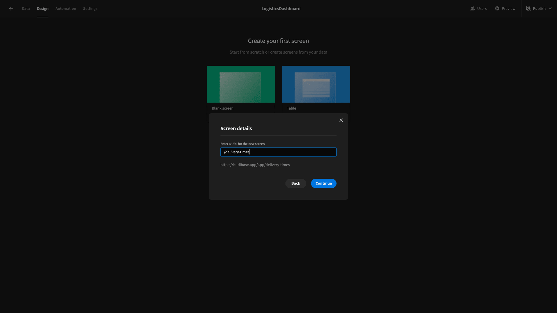
We’re prompted to give our screen a URL extension. We’ll call our /delivery-times. We can also set an access level that users will need to view this screen.
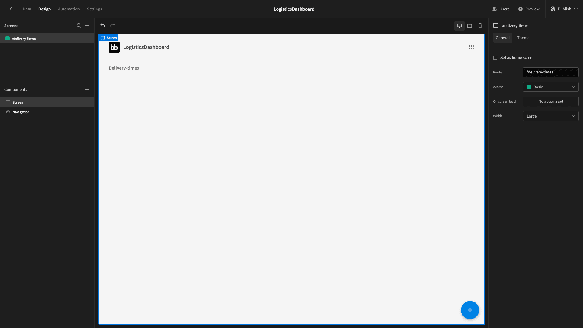
Now, we have a blank screen where we can start adding components:
The first thing we’ll do is add a container component - and set its direction to horizontal:
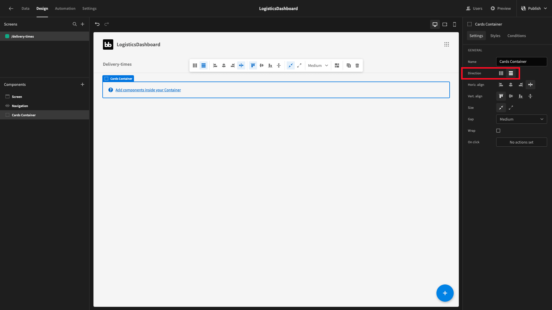
Within this, we’ll place three cards blocks. These will take a dataset, iterate over each entry, and display the relevant values for whatever attribute we want them to. Without configuring them, they’ll look like this:
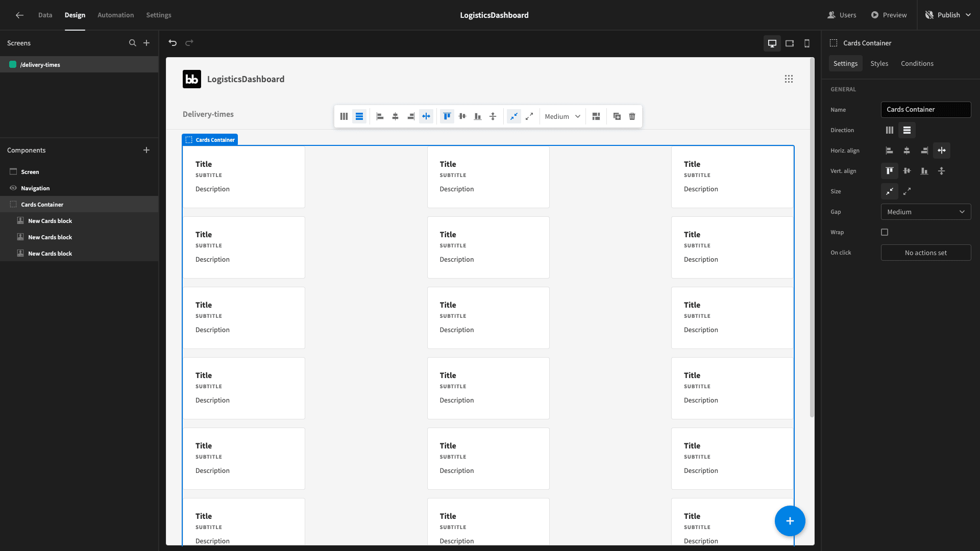
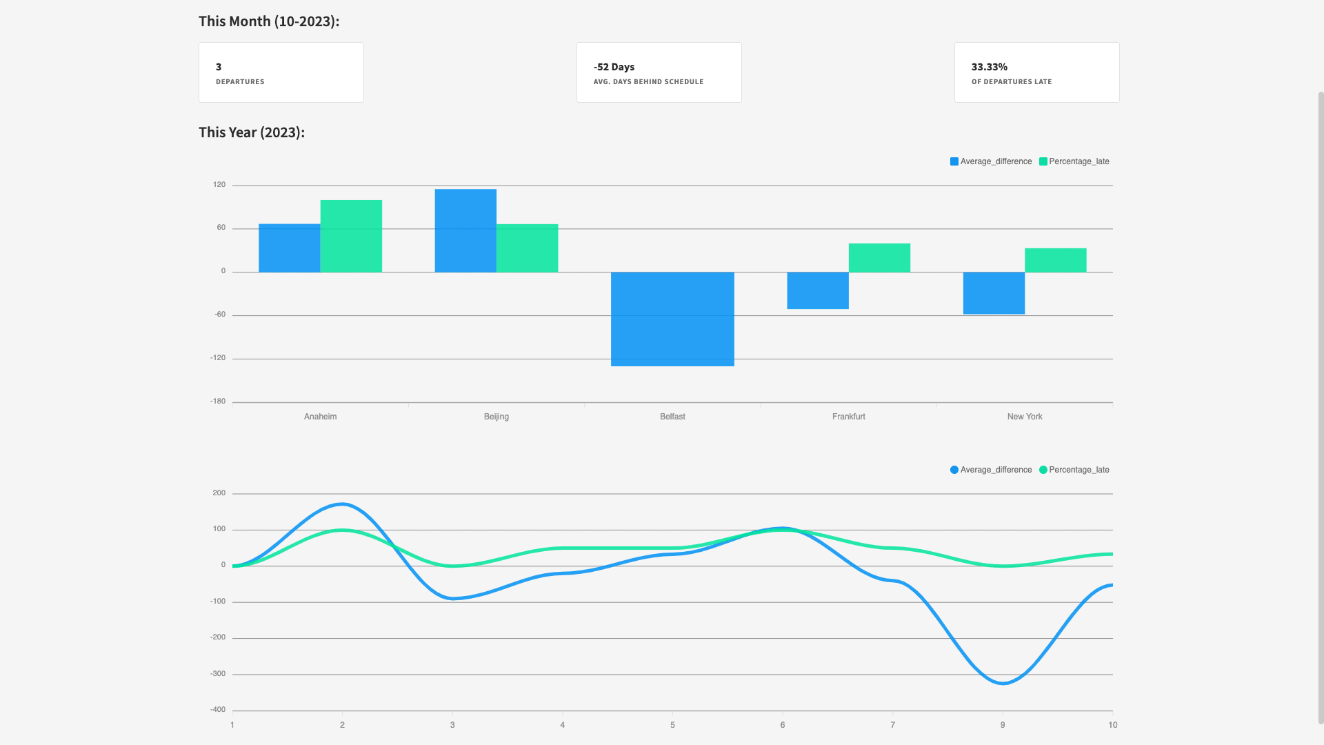
When we’re done, we want to have each cards block displaying a single card with figures of this month representing:
- The number of departures.
- The average number of days ahead/behind schedule across these departures.
- The percentage of deliveries that have been late.
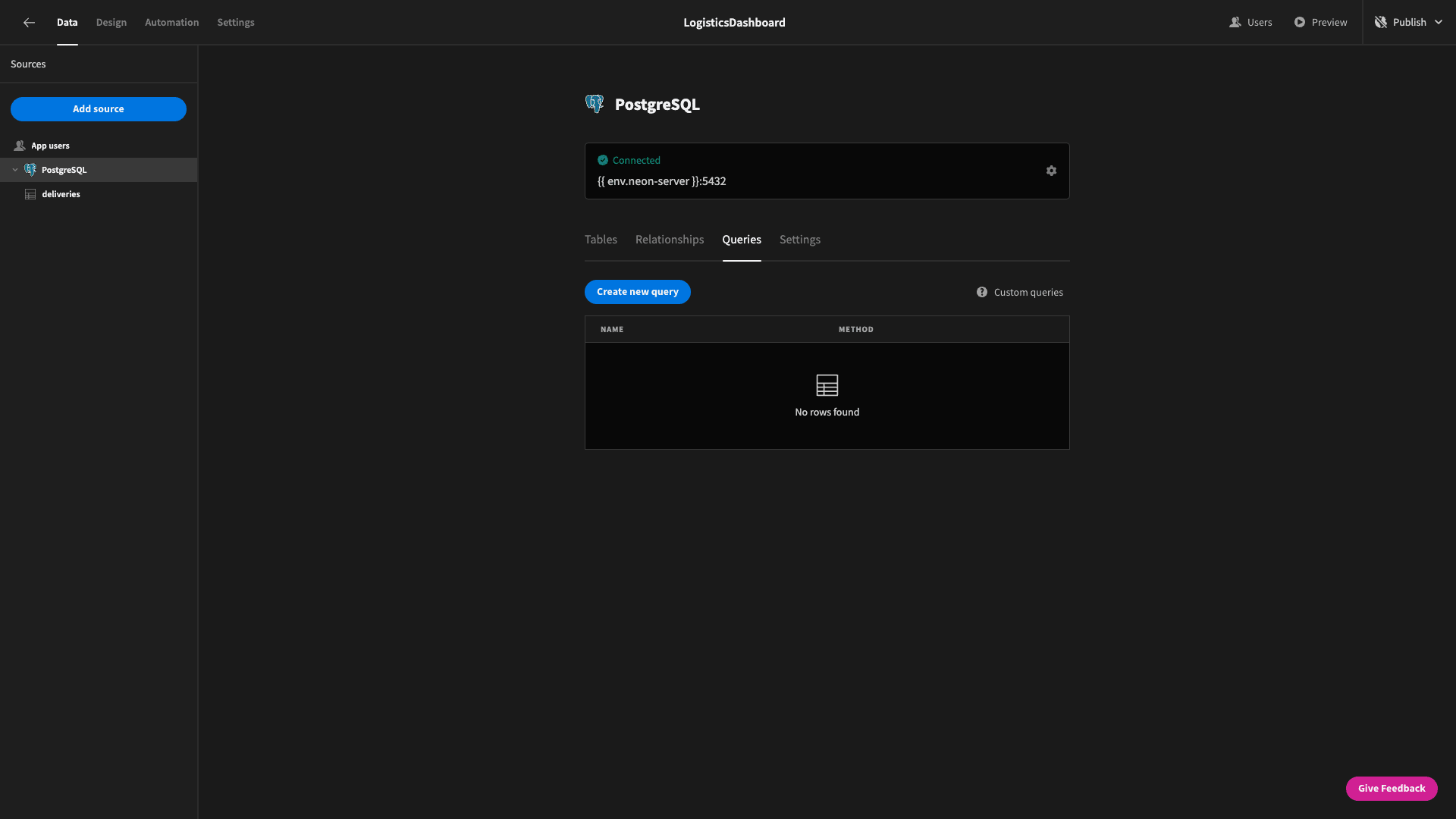
Head back to the data section and select create new query:
We’ll call this lateness_by_month:
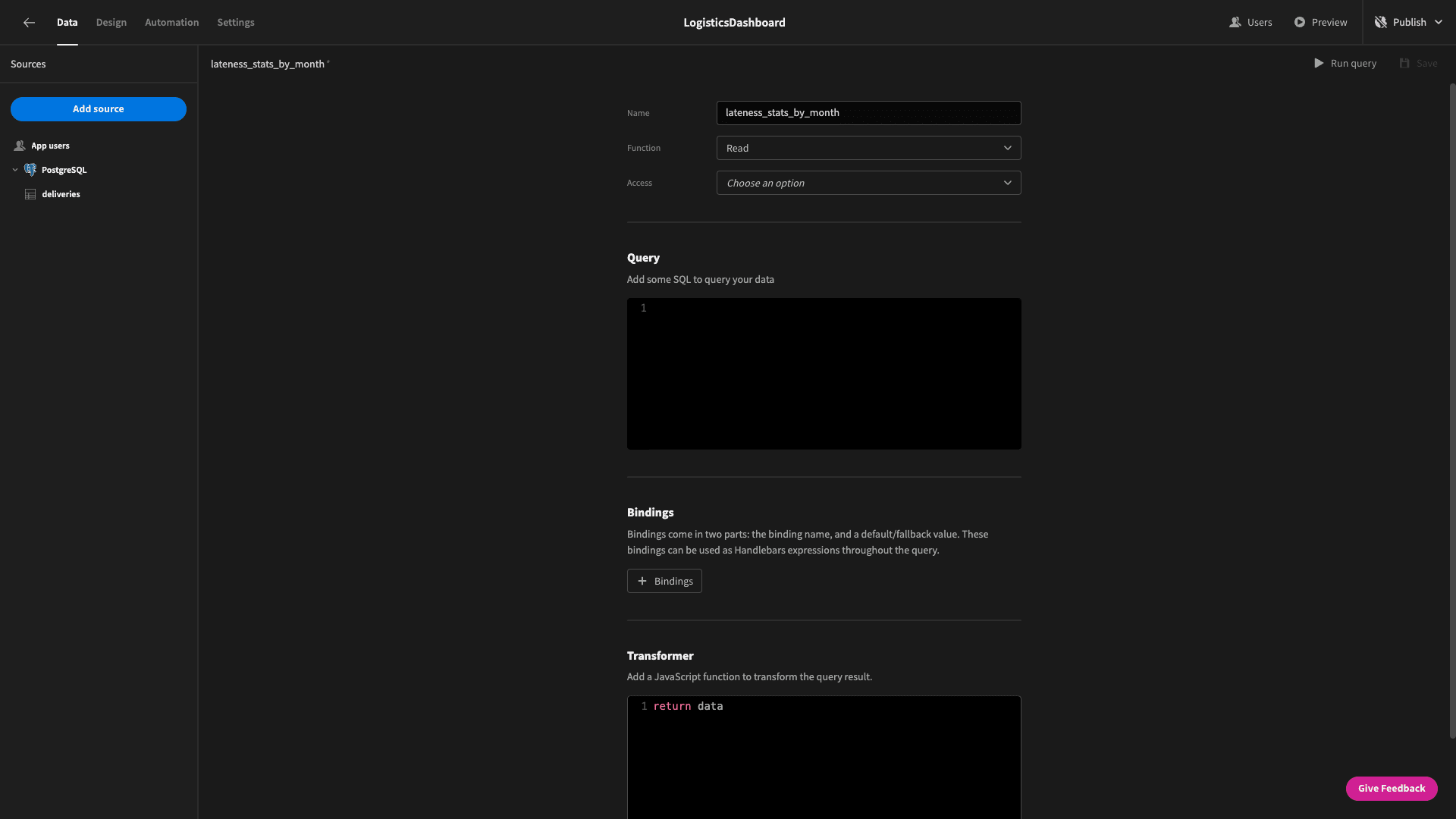
We’re going to select five pieces of information from our table. These are:
- The numerical month.
- The numerical year.
- The count of entries.
- The average difference between the real delivery time (arrival_date - departure_date) and the estimated time.
- The percentage of entries where (arrival_date - departure_date) is greater than the estimate.
We’re going to group these by the month and year - and sort them by the year and month ascending.
Our SQL query is:
1SELECT
2
3 CAST(EXTRACT(MONTH FROM departure_date) AS INTEGER) AS month,
4
5 CAST(EXTRACT(YEAR FROM departure_date) AS INTEGER) AS year,
6
7 COUNT(*) AS departure_count,
8
9 ROUND(AVG(EXTRACT(DAY FROM (arrival_date - departure_date))::REAL - estimated_days)) AS average_difference,
10
11 (COUNT(*) FILTER (WHERE EXTRACT(DAY FROM (arrival_date - departure_date))::REAL > estimated_days)::FLOAT / COUNT(*)) * 100 AS percentage_late
12
13FROM
14
15 deliveries
16
17GROUP BY
18
19 EXTRACT(MONTH FROM departure_date),
20
21 EXTRACT(YEAR FROM departure_date)
22
23
24
25ORDER BY
26
27 EXTRACT(YEAR FROM departure_date) ASC,
28
29 EXTRACT(MONTH FROM departure_date) ASC;And here’s what it looks like when we run it in Budibase:

For each month, the query will return a data object like this:
 1{
 2
 3 "month": 10,
 4
 5 "year": 2022,
 6
 7 "departure_count": "3",
 8
 9 "average_difference": 244,
10
11 "percentage_late": 66.66666666666666
12
13}
Save this and head back to the design section.
Our task now is to configure our cards to display the data we want. Under each card, we can change the name to make things a bit easier to follow in the Budibase builder - as well as set their data source to our new query:
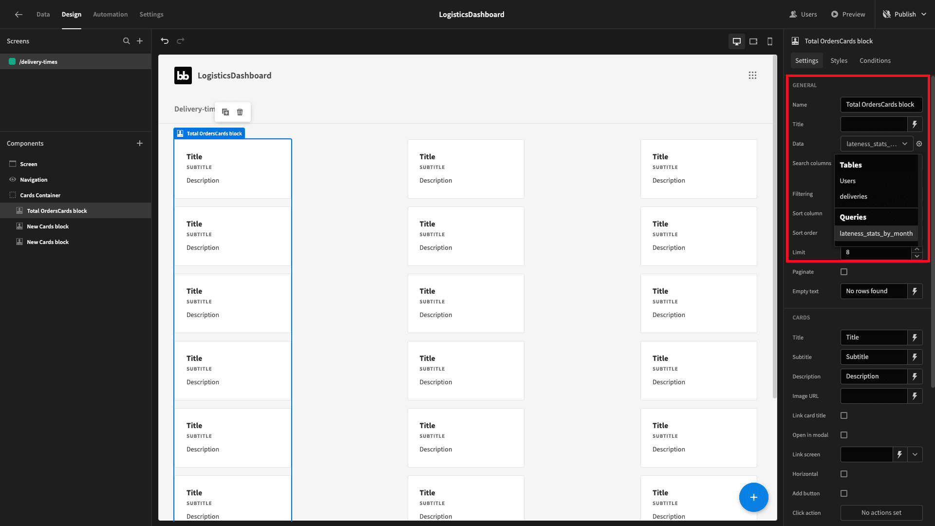
For this first one, we want the title to display the number of deliveries we’ve sent out this month - and the subtitle to show a bit of text that explains what this figure is.
We first need to set a filter so that the cards block only iterates over the one row where the month and year attributes match the current month.
So, we’ll open up the filters drawer and create two expressions:
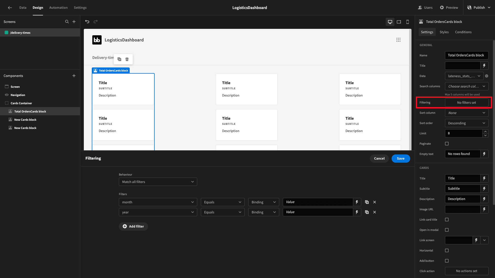
For the reference value, we can use either handlebars or JavaScript to get the current numerical month and year.
We’re going to use JavaScript, so for the month, the value binding is:
1var currentDate = new Date();
2
3return currentDate.getMonth() + 1;
Note that we need to add one here because JavaScript uses zero-based counting - so the index for January is 0.
We want to set the reference value for the year to:
1var currentDate = new Date();
2
3return currentDate.getFullYear();
Now - as you can see - we only have one card in our block:
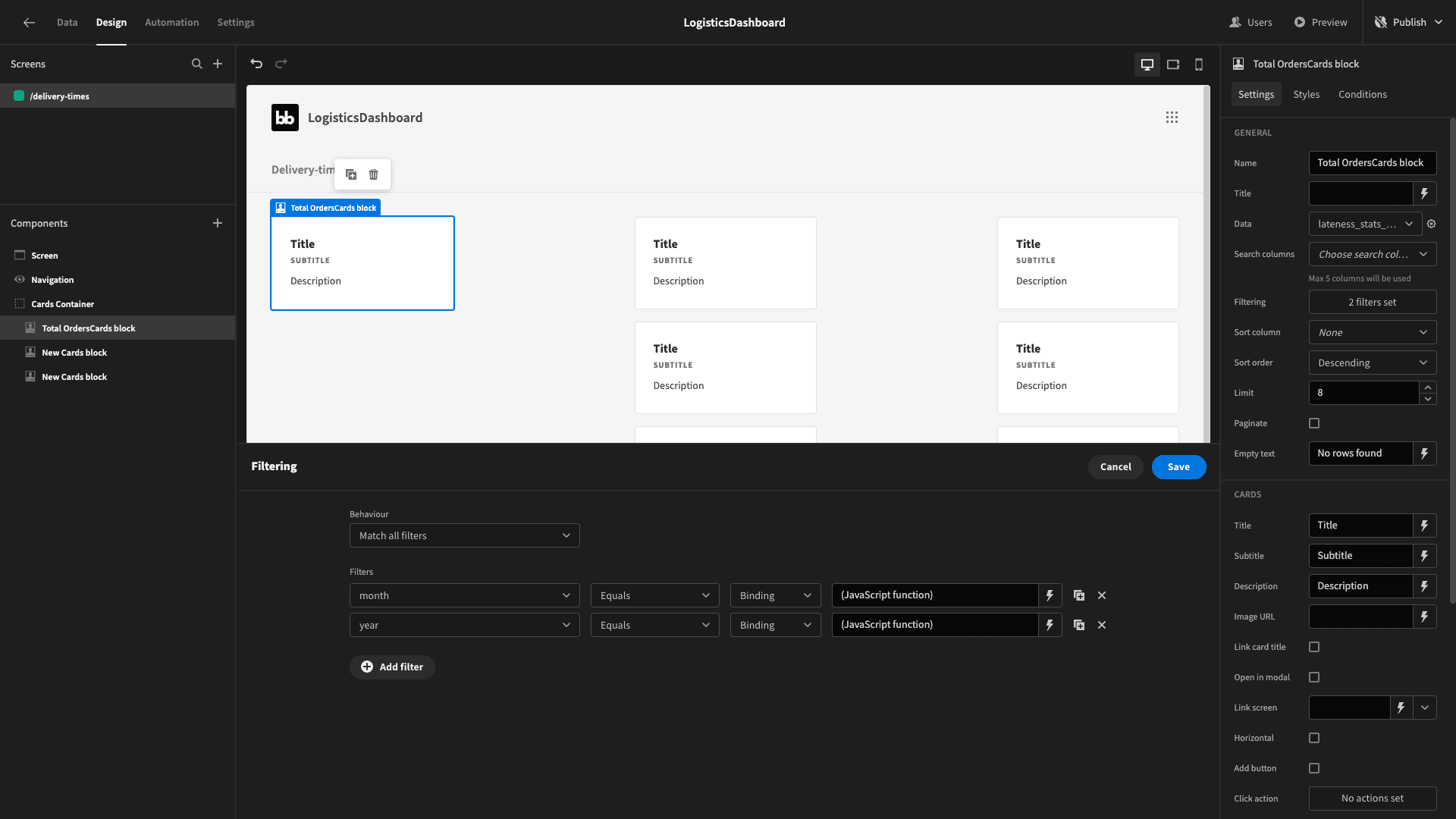
While we have this fresh in our minds, we might as well repeat the same processes to apply these filters to all three of our cards blocks - giving us:
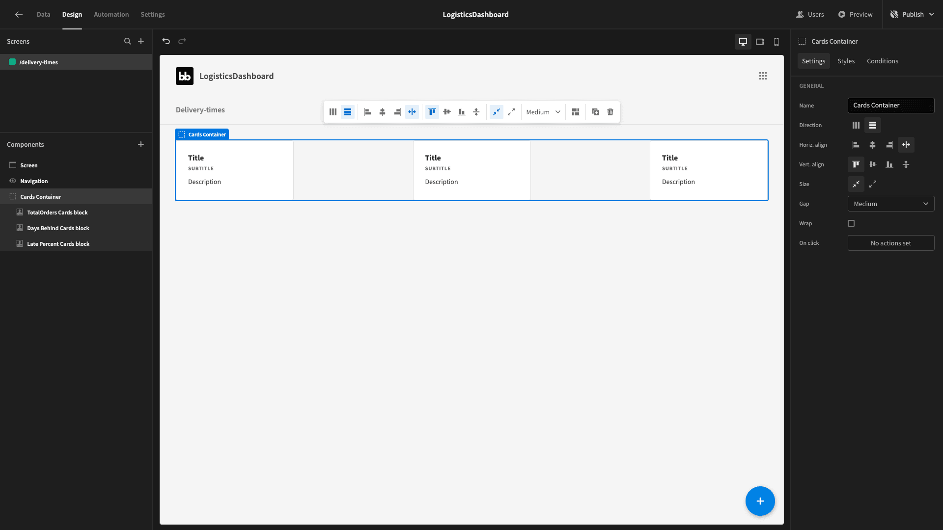
We’ll set the first card’s title attribute to our departure_count using Budibase’s handlebar binding selector:

And we’ll change the subtitle to departures - as well as removing the description:
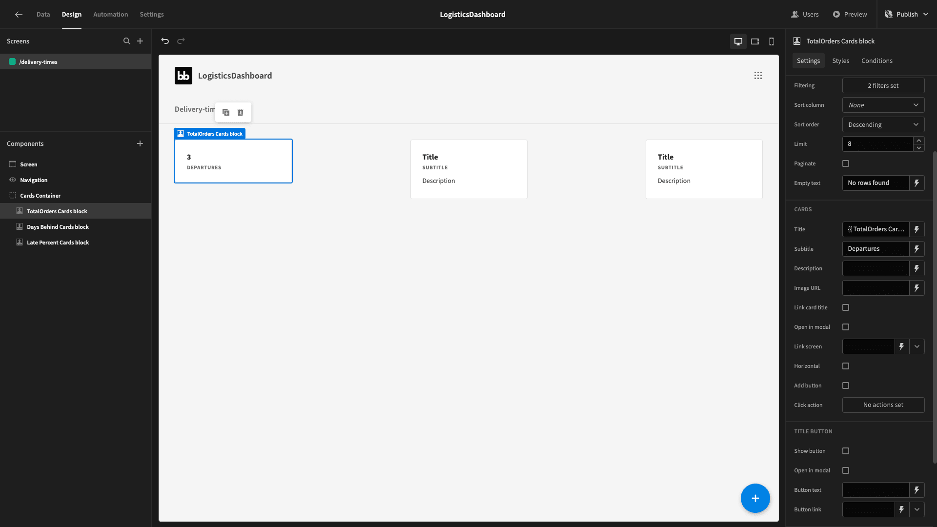
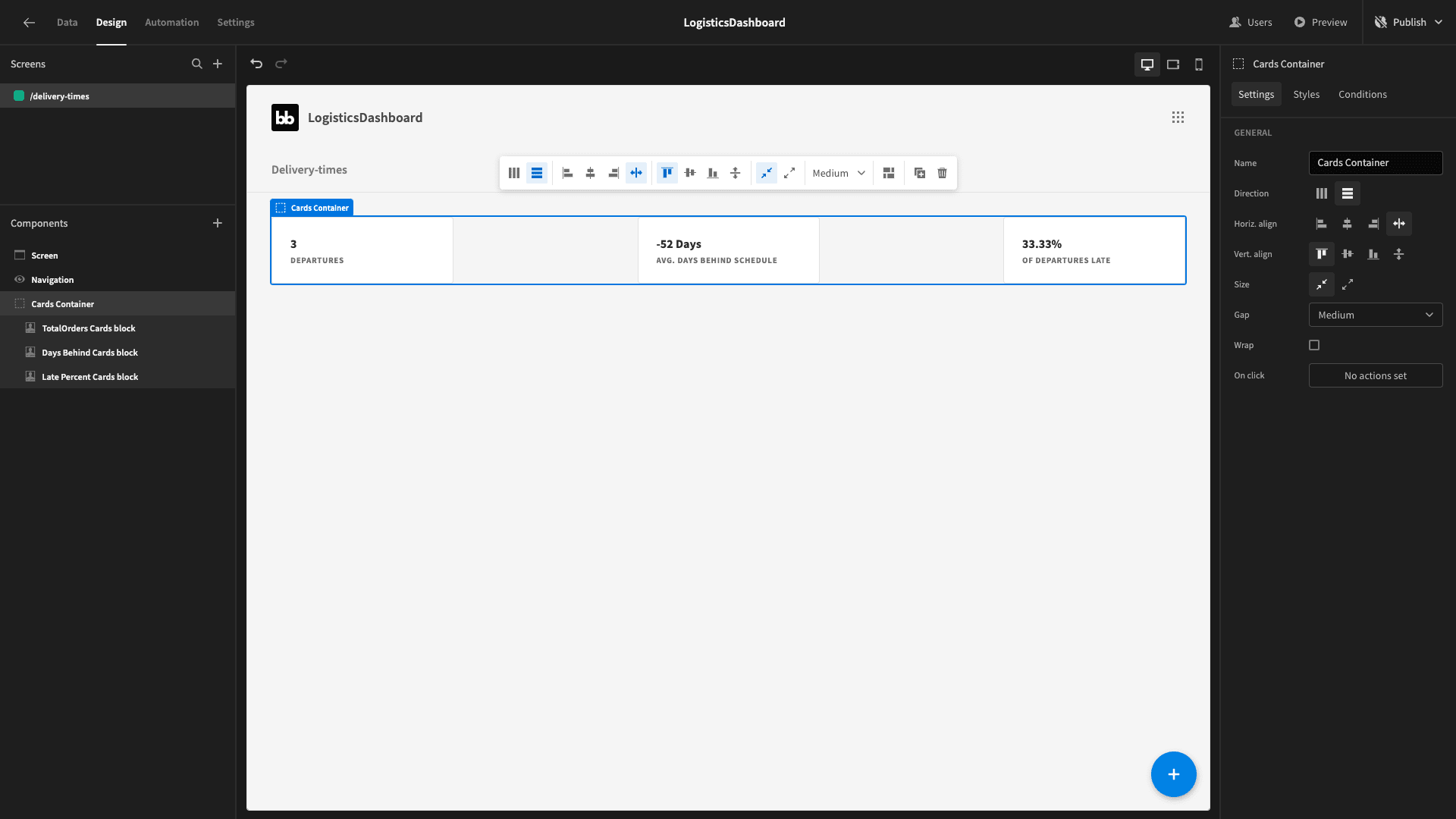
For the second card, the title binding we’ll use is:
1{{ Days Behind Cards block.lateness_stats_by_month.average_difference }} DaysAnd the subtitle is avg. days behind schedule.
For the third, we’ll use the following JavaScript as the title:
1return $("Late Percent Cards block.lateness_stats_by_month.percentage_late").toFixed(2) + "%";And set the subtitle to of departures late.
Now we have this:
Lastly, we’ll add a headline component above our container, with its text attribute set to the following JavaScript expression:
1var currentDate = new Date();
2
3return "This Month (" + (currentDate.getMonth()+1) + "-" + currentDate.getFullYear() + "):"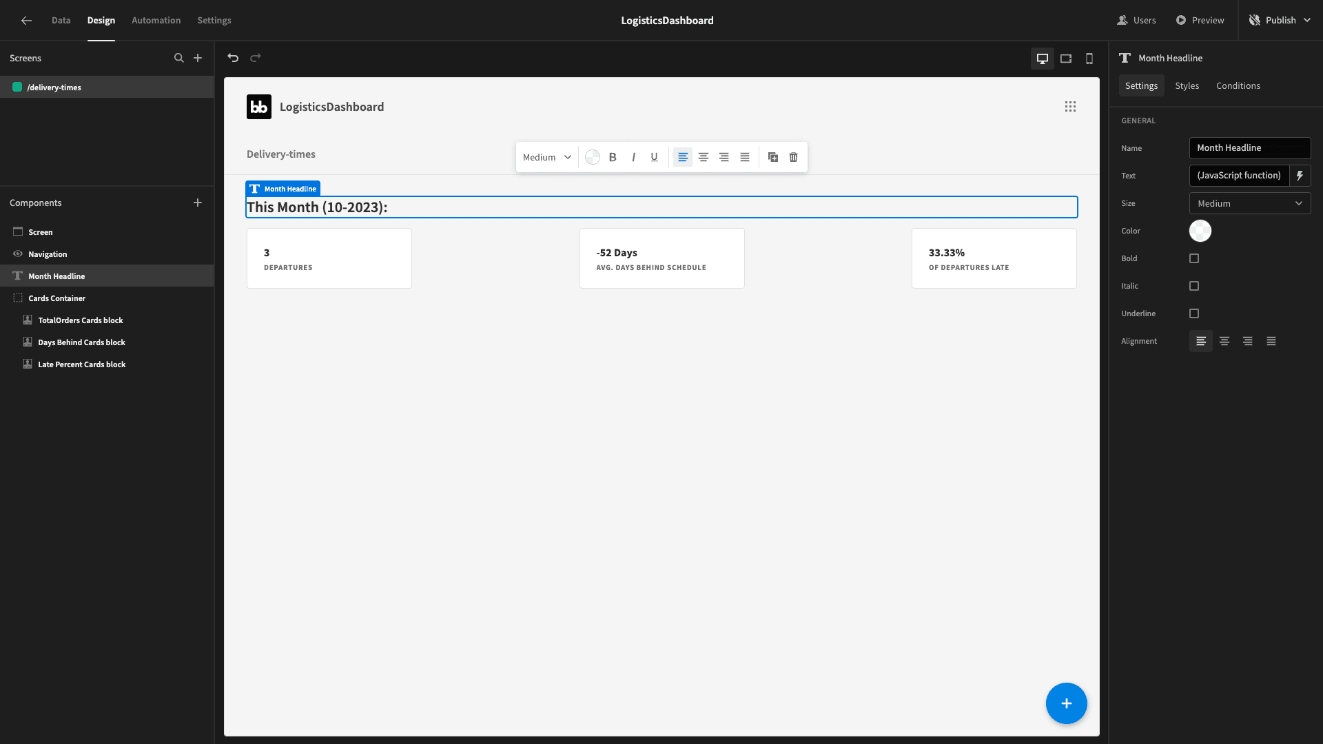
And that’s our cards done.
3. Distribution center breakdown chart
Next, we want to create a bar chart that’s going to show the average percentage of orders that have been late this year from each distribution center - along with the average difference between our real lead time and our estimate.
We’ll start by creating another query, which we’ll call lateness_stats_by_source_by_year.
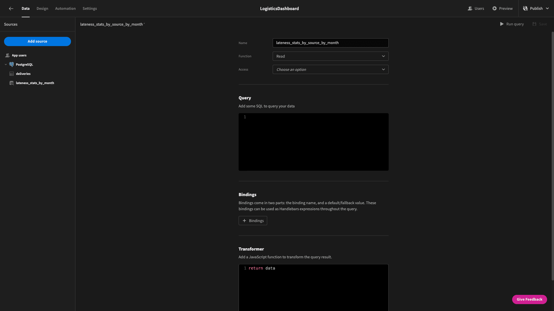
We’re basically going to use the exact same query - with a couple of modifications. We’re replacing the SELECT, GROUP BY, and ORDER BY statements for the month attribute with similar statements for the source.
So, our new query is:
1SELECT
2
3source,
4
5CAST(EXTRACT(YEAR FROM departure_date) AS INTEGER) AS year,
6
7ROUND(AVG(EXTRACT(DAY FROM (arrival_date - departure_date))::REAL - estimated_days)) AS average_difference,
8
9(COUNT(*) FILTER (WHERE EXTRACT(DAY FROM (arrival_date - departure_date))::REAL > estimated_days)::FLOAT / COUNT(*)) * 100 AS percentage_late
10
11FROM
12
13 deliveries
14
15GROUP BY
16
17 EXTRACT(YEAR FROM departure_date),
18
19 source
20
21ORDER BY
22
23EXTRACT(YEAR FROM departure_date),
24
25 source;When we run that:
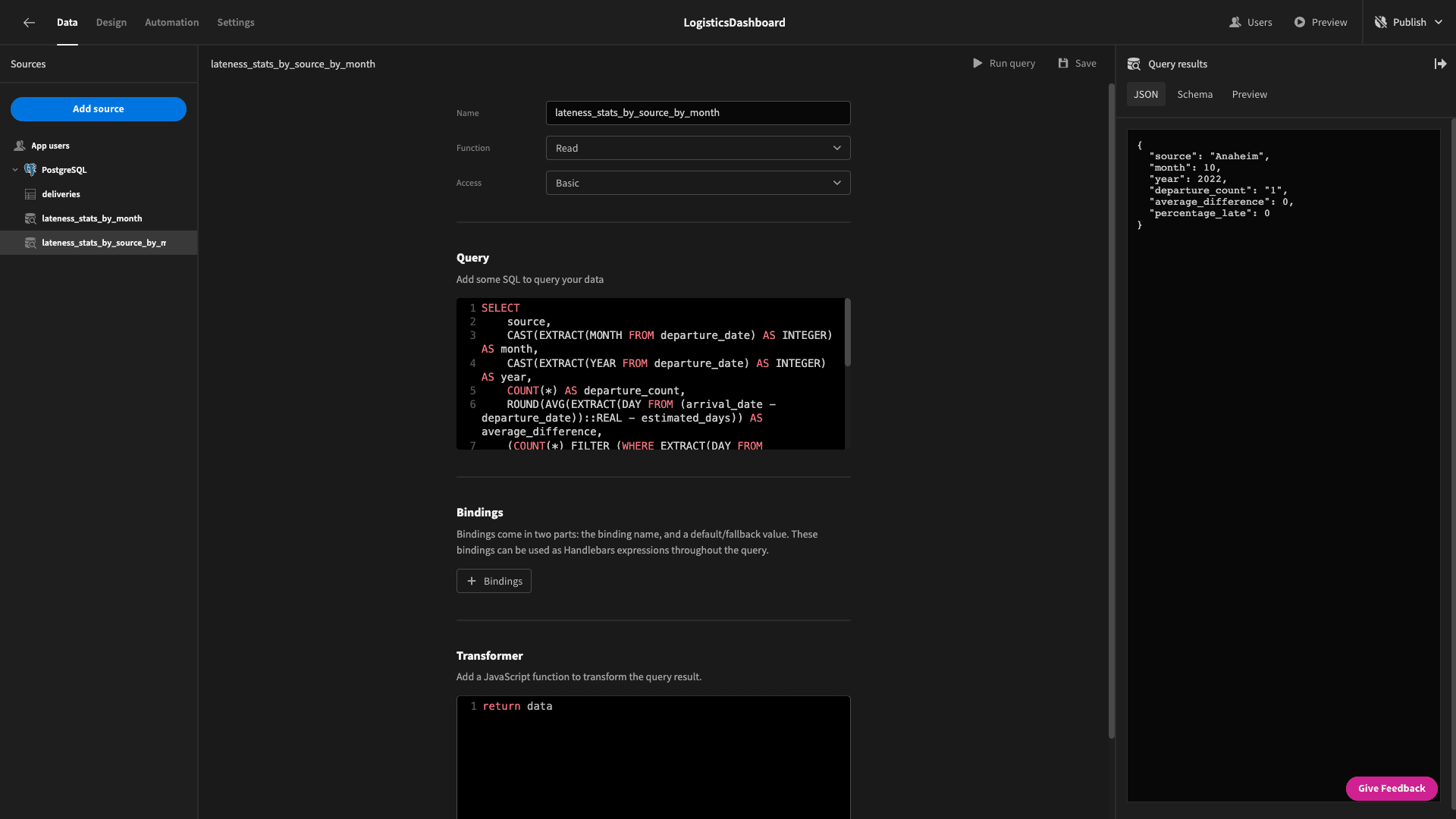
This is the schema of the data objects that are returned:
 1{
 2
 3 "source": "Anaheim",
 4
 5 "year": 2022,
 6
 7 "average_difference": 0,
 8
 9 "percentage_late": 0
10
11}
So, we’re getting the same information back as before - but we’re also breaking it down by source.
Back to the design tab.
Let’s add a chart block, give it a name, and set its data to our new query:
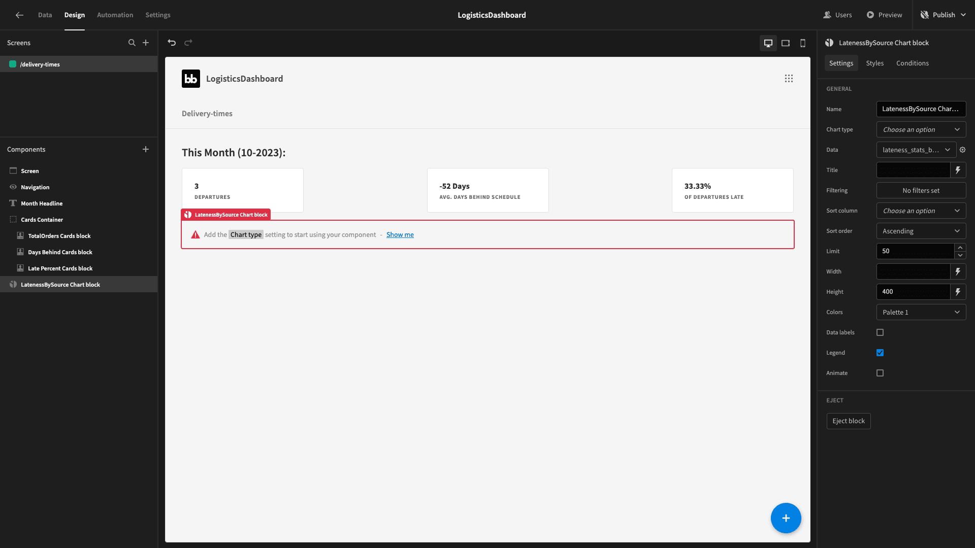
Obviously, this won’t display anything until we tell it what we want to see. We’ll start by setting the chart type to bar.
We need to configure which attributes we’ll use for each axis on the graph. We want the X axis to show the source - so we’ll use this as the label column:
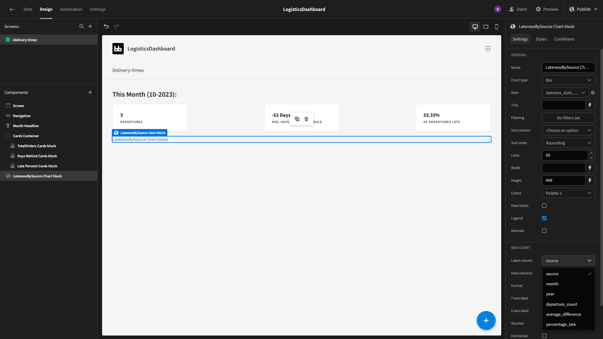
We’ll set the data column to show average_difference and percentage_late:

But - this gives us multiple items on the X axis for each source. This is because it’s showing us data for this year and last year.
So, we can add a filter to only show entries for the current year, using the exact same JavaScript expression we used for this earlier.
Then we have:
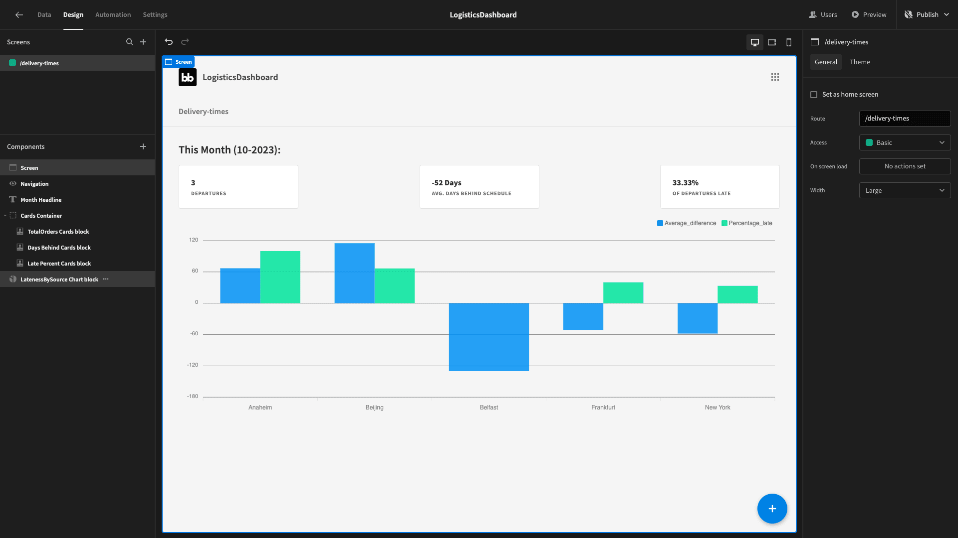
We’ll also add a headline above this using a similar expression to the one we have already:

4. Performance over time
We’re going to add one more chart on this screen. This time we’re going to create a line graph that will show the trend in our average_difference and percentage_late attributes over time. That is month by month.
We don’t even need a new query for this one. We can just reuse our lateness_stats_by_month query.
So, let’s add another chart block to pull in that data - this time, setting its type to line. We’ll set the label column to month and the data columns to average_difference and percentage_late - and then copy across our filtering statement.
Our completed logistics dashboard screen looks like this:
5. Duplicate our dashboard UI
Our second screen is going to use the same format to display data about our budget utilization.
We’ll duplicate this new screen and call the new one /costs.

Now, we can start to swap out the appropriate data.
Queries for cost cards
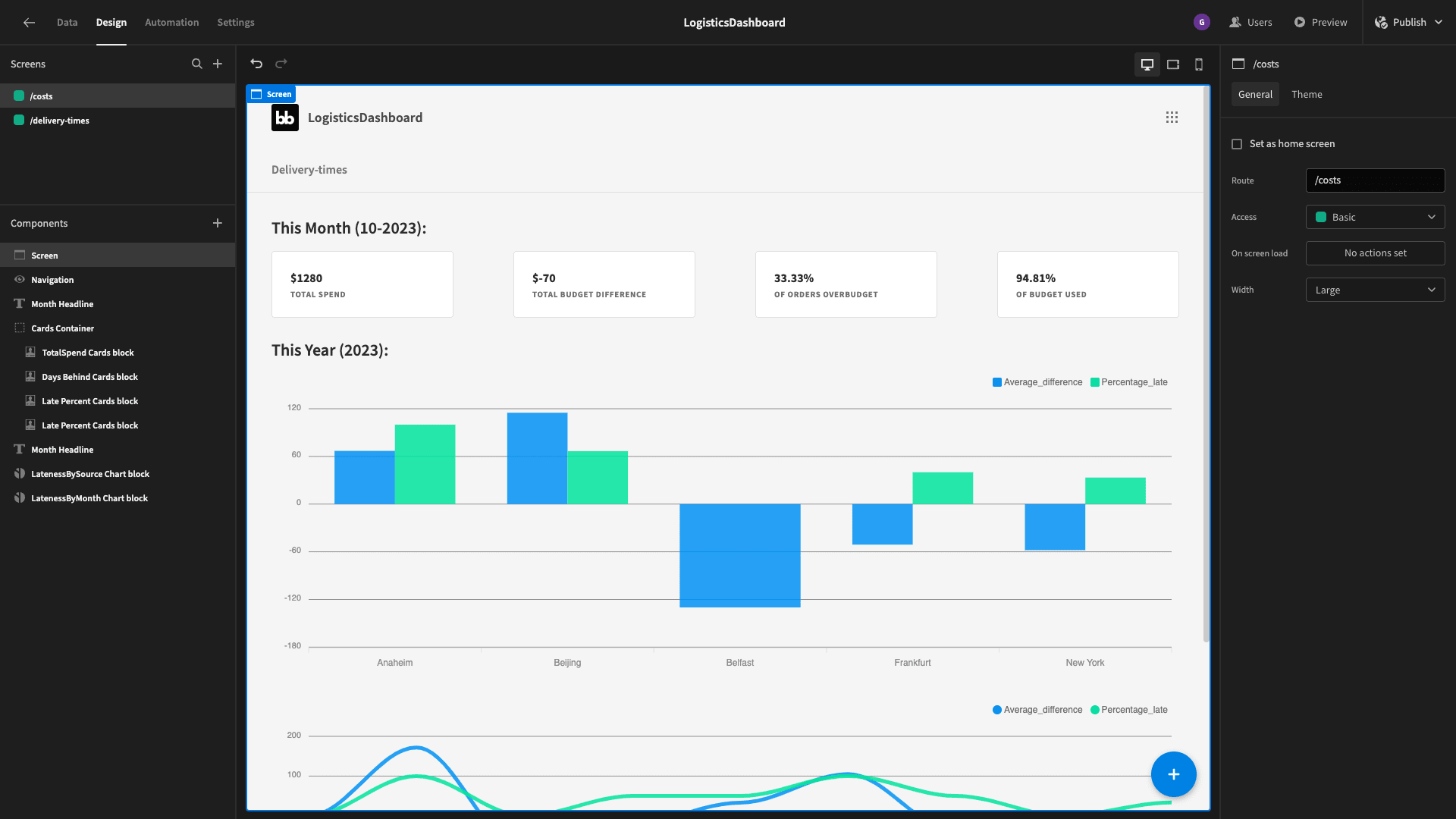
This time, we’re actually going to use four cards, so we can duplicate one of the existing ones for now. These will show the following data points for the current month:
- The total spend.
- The difference between our total spend and our total estimated spend.
- The percentage of deliveries that have gone over budget.
- The percentage of our overall budget that we’ve used.
We’ll create a query called overspend_by_month. This will select:
- The numerical month.
- The numerical year.
- The sum of all of the rows’ actual cost minus estimated cost.
- The percentage of the rows where the actual cost exceeds the estimated cost.
- The sum of all of the actual costs over the sum of all of the estimated costs - also expressed as a percentage.
We’ll group these by the numerical month and year.
So, our query is:
1SELECT
2
3 CAST(EXTRACT(MONTH FROM departure_date)AS INTEGER) AS month,
4
5 CAST(EXTRACT(YEAR FROM departure_date) AS INTEGER) AS year,
6
7 SUM(actual_cost) AS total_spend,
8
9SUM(actual_cost - estimated_cost) AS total_spend_difference,
10
11(COUNT(*) FILTER (WHERE actual_cost > estimated_cost)::FLOAT / COUNT(*)) * 100 AS percentage_overspent,
12
13SUM(actual_cost) / SUM(estimated_cost) * 100 AS percentage_budget_used
14
15FROM
16
17 deliveries
18
19GROUP BY
20
21 CAST (EXTRACT(MONTH FROM departure_date) AS INTEGER),
22
23 CAST(EXTRACT(YEAR FROM departure_date)AS INTEGER);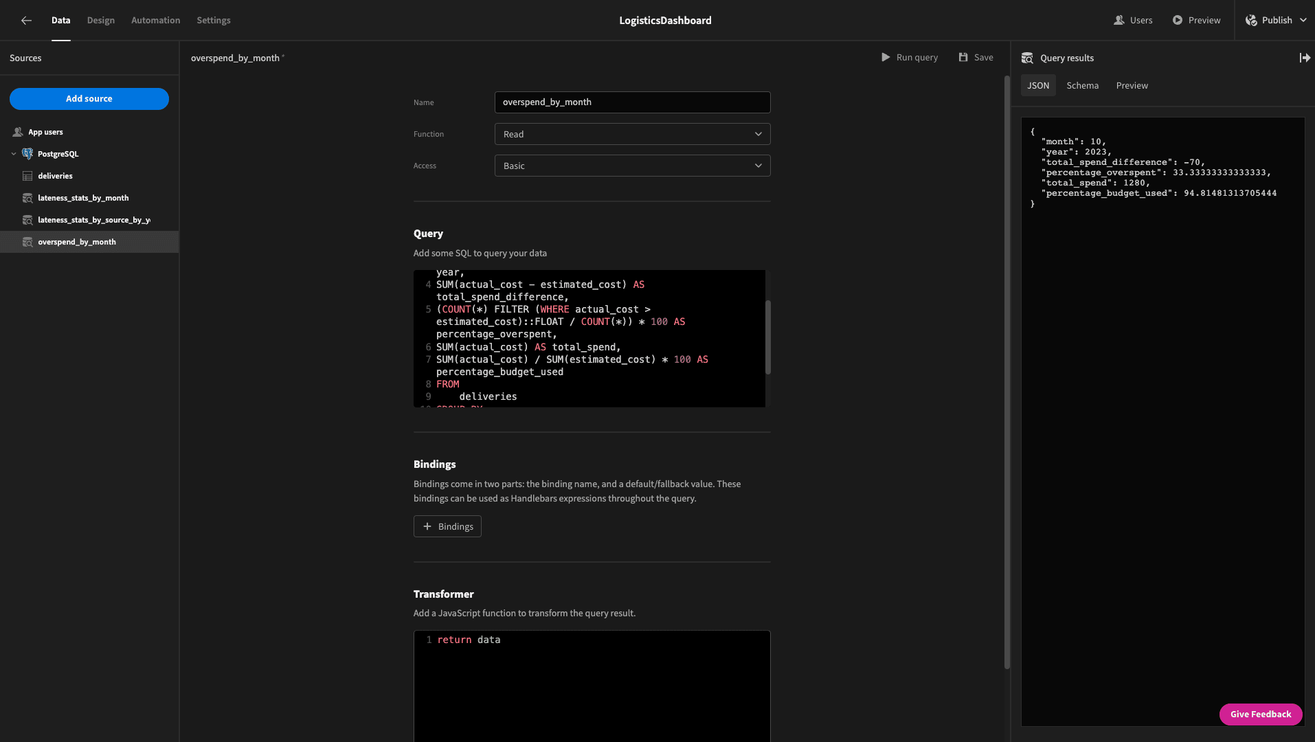
And here’s what this returns:
 1{
 2
 3 "month": 10,
 4
 5 "year": 2023,
 6
 7 “total_spend”: 1280,
 8
 9 "total_spend_difference": -70,
10
11 "percentage_overspent": 33.33333333333333,
12
13 "percentage_budget_used": 94.81481313705444
14
15}
We’ll then go back to the design tab and reconfigure our cards to show these metrics.
This gives us:
Queries for cost charts
Next, we want to create a new query that will give us an equivalent bar chart for budget utilization grouped by source.
We need a query that returns the:
- Source.
- Total Estimated cost.
- Total Actual cost.
- Total Spend Difference.
- Numerical Month.
It needs to be grouped and ordered by the source and the numerical year.
Our query is:
1SELECT
2
3 source,
4
5 CAST(EXTRACT(YEAR FROM departure_date) AS INTEGER) AS year,
6
7 SUM(actual_cost - estimated_cost) AS total_spend_difference,
8
9 SUM(actual_cost) AS total_actual_cost,
10
11 SUM(estimated_cost) AS total_estimated_cost
12
13FROM
14
15 deliveries
16
17GROUP BY
18
19 EXTRACT(YEAR FROM departure_date),
20
21 source
22
23ORDER BY
24
25 EXTRACT(YEAR FROM departure_date),
26
27 source;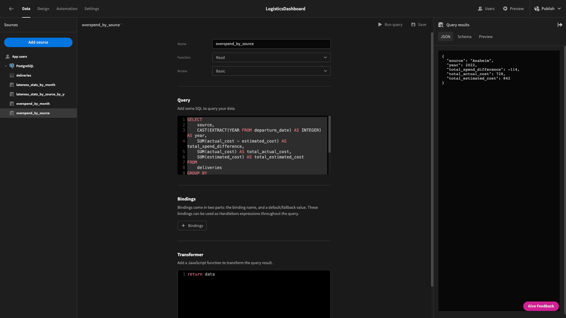
This returns:
 1{
 2
 3 "source": "Anaheim",
 4
 5 "year": 2022,
 6
 7 "total_spend_difference": -114,
 8
 9 "total_actual_cost": 728,
10
11 "total_estimated_cost": 842
12
13}
Then, we can go back to the design section and swap out our attributes so we have:
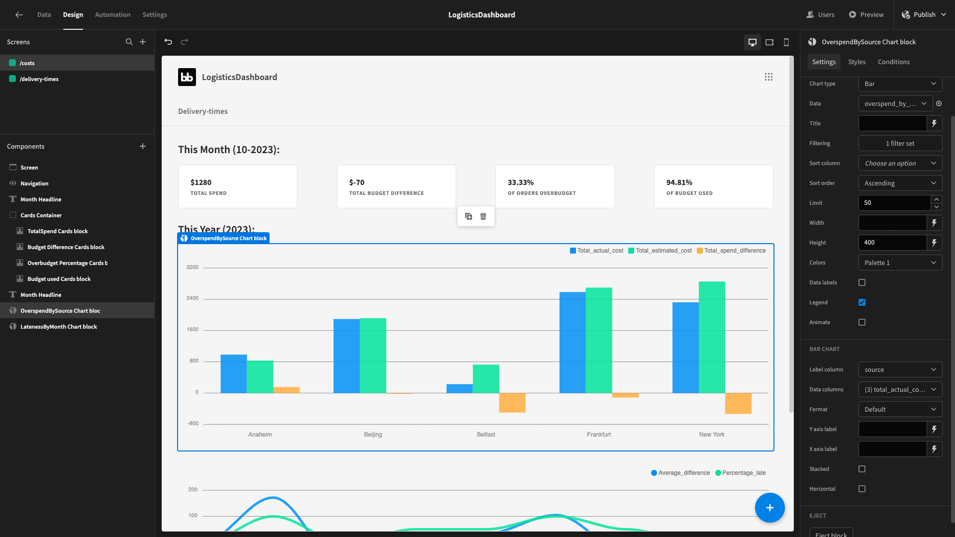
We want our linegraph to show the trend over the course of this year for our budget utilization. Specifically, we want to show the total percentage of deliveries that overspend and the total percentage of our budget that we’ve used each month.
We’ll need one last query to achieve this. We’ll call it utilization_by_month.
The query is:
1SELECT
2
3 CAST(EXTRACT(MONTH FROM departure_date)AS INTEGER) AS month,
4
5 CAST(EXTRACT(YEAR FROM departure_date) AS INTEGER) AS year,
6
7 (COUNT(*) FILTER (WHERE actual_cost > estimated_cost)::FLOAT / COUNT(*)) * 100 AS percentage_overspent,
8
9 SUM(actual_cost) / SUM(estimated_cost) * 100 AS percentage_budget_used
10
11FROM
12
13 deliveries
14
15GROUP BY
16
17 CAST (EXTRACT(MONTH FROM departure_date) AS INTEGER),
18
19 CAST(EXTRACT(YEAR FROM departure_date)AS INTEGER);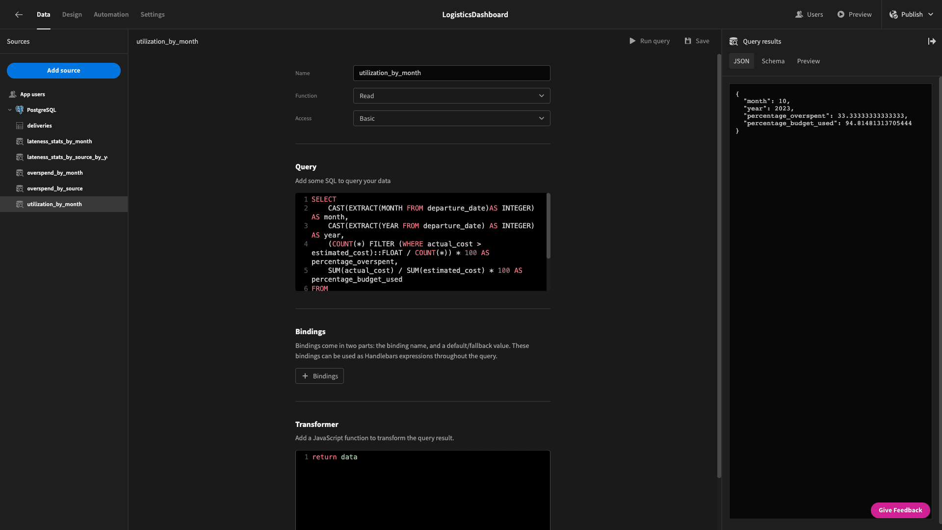
The objects that are returned look like this:
 1{
 2
 3 "month": 10,
 4
 5 "year": 2023,
 6
 7 "percentage_overspent": 33.33333333333333,
 8
 9 "percentage_budget_used": 94.81481313705444
10
11}
And - when we swap out these values on our line chart - our finished report looks like this:

Design tweaks
The last thing we want to do is make a couple of design changes to improve the UX of our logistics dashboard.
First, we’ll head to the navigation menu and hit configure links. This lets us choose which screens appear in our nav menu and what text to give them:
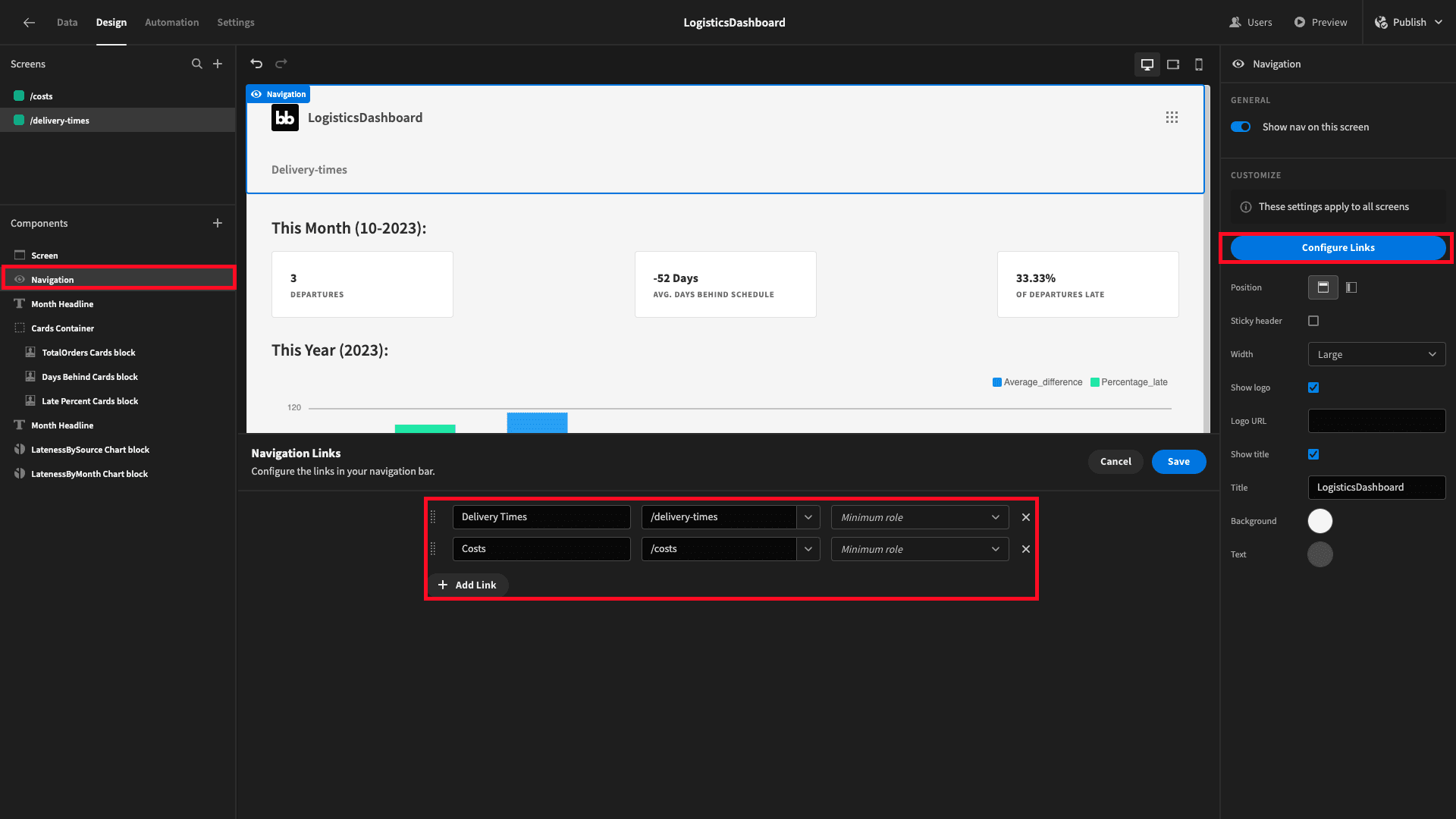
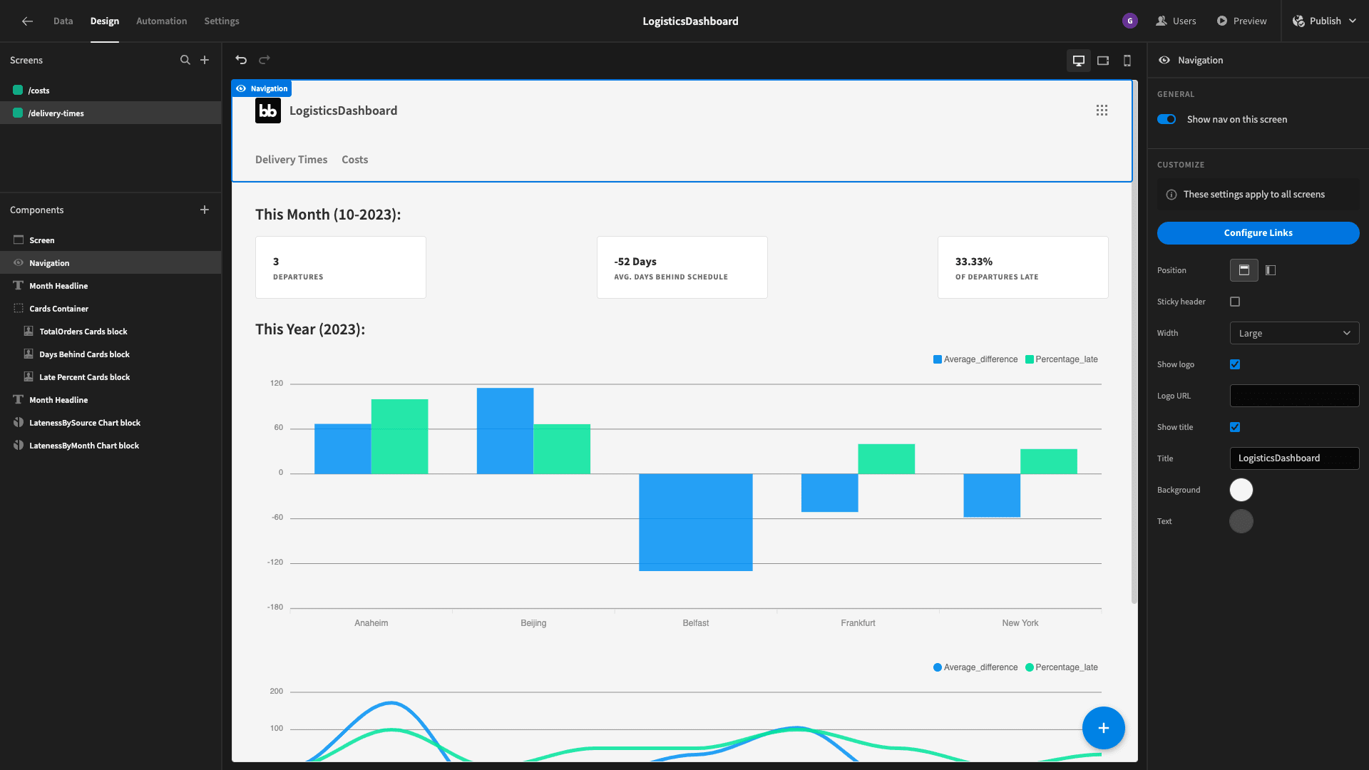
That way, users can easily navigate between our two dashboard UIs:
Then we’ll head to theme and choose Nord:

Finally, for each of our charts, we can play around with the color palettes to make things a bit more visually appealing. We’ve also selected a straight curve for our line graphs:
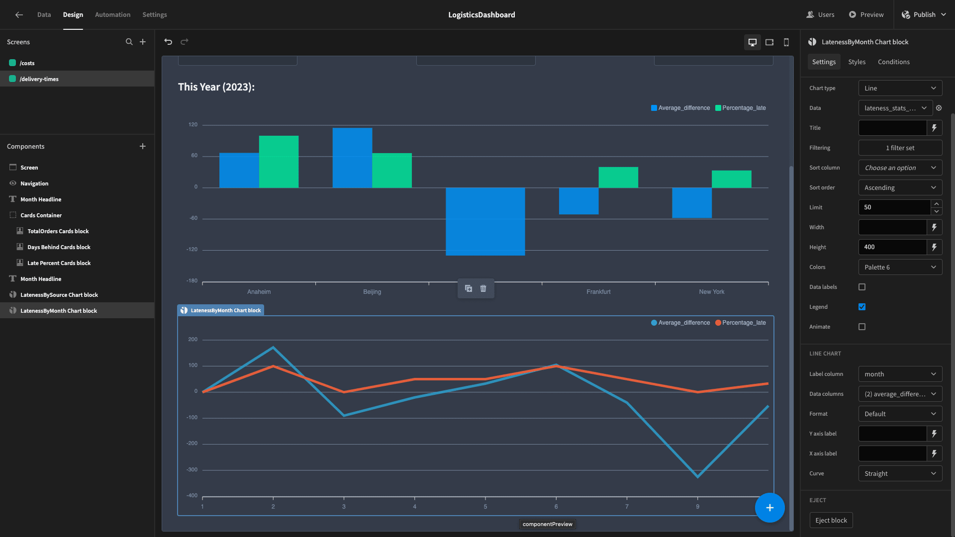
Here’s the finished product:

To learn more about how Budibase empowers IT teams in thousands of businesses to turn data into action, check out our product overview .